[–] ninkendo 4 days ago
[–] redwall_hp 4 days ago
The preference, either way, is an important accessibility feature.
[–] JulianPaul 4 days ago
[–] redwall_hp 2 days ago
The same blur is present for me on text on a white background...it just wasn't as apparent to me as, say, blue glowing signs at night or a microwave clock. But wearing glasses, the text is noticeably crisper and less "bold" looking. Which results in not having eye strain. The halation is still there, but it's just less obvious what's going on.
I just assumed everyone saw the same thing at night for a long time...and would never have even guessed something was off about regular black-on-white text without having an optometrist clue me in.
[–] kps 4 days ago
[–] mrweasel 4 days ago
It's good that it exists though. Some people have different work environments or other types of vision problems than astigmatism, and if dark mode works for them supporting it in more places is good.
Maybe we could also have a way to indicate that the user wants high contrast, but that starts becoming a lot of special cases to design for.
[–] cosmic_cheese 4 days ago
If/when flat design goes the way of the dodo and light themes are designed sanely once again I’ll pick them back up.
[–] nozzlegear 4 days ago
[–] loloquwowndueo 4 days ago
[–] figmert 4 days ago
[–] garbagecreator 3 days ago
[1]: https://stephango.com/flexoki [2]: https://go.dev/blog/go-fonts#go-mono-fonts
[–] MBCook 4 days ago
I don’t get the point at all (and don’t want to hear it, I’ve seen the arguments before).
It’s nice it’s there for people who want it but it baffles me it’s constantly treated like the greatest thing ever.
[–] echoangle 4 days ago
Because wood is bright and you can’t really print white ink on a black paper?
There might be a usability advantage but using black ink on white paper doesn’t really prove that, that’s just the easier option of the two possible choices.
[–] MBCook 4 days ago
[–] ssl-3 4 days ago
I can't buy a white pencil or ballpoint pen that works as reliably as something from Ticonderoga or Bic. White Sharpie markers do not exist. White inkjet cartridges do exist, but they're specialized items that have a high ratio of solids and this produces far worse clogging issues than the CMYK we're used to using.
[–] echoangle 4 days ago
[–] kalleboo 4 days ago
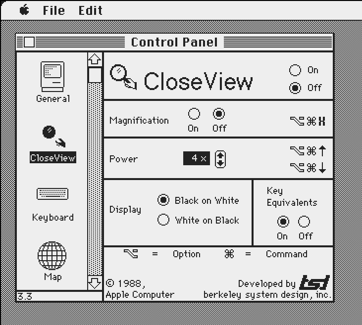
Apple soon started offering a dark mode as an accessibility feature https://kalleboo.com/linked/mac_closeview_control_panel.png
[–] MBCook 4 days ago
It was not an intended way to use things all the time for a large chunk of the user population.
Not the same.
[–] kalleboo 4 days ago
When Apple introduced Liquid Glass, "reduce transparency" was also an accessibility feature.
[–] MBCook 4 days ago
But that’s still quite different to me to how people treat dark mode.
I promise you 20/30/40% of people or whatever were not using invert colors on the Mac or Windows.
[–] bondolo 4 days ago
[–] steve1977 4 days ago
[–] Telaneo 4 days ago
That being that black paper is more expensive than white and that we're stuck with historical precedence?
Reading white text on a black background is much, much easier for me, and the few times I've had the pleasure of doing the same with paper, I still found it to be better. I haven't tried longer texts, since nobody's publishing actual books with black paper, but I'm willing to bet it I'd feel the same about those.
This just reads to me the 'serifs are important because they make reading easier (when reading of paper)', which doesn't reflect my lived experience at all. The only reason these phenomena seem to exist are historical accident and people being used to them.
[–] wiredfool 4 days ago
[–] steve1977 4 days ago
[–] rbits 4 days ago
[–] talmr 4 days ago
Back in the day (work from office lol) people would always pick on me for that, playfully of course.
[–] garbagecreator 3 days ago
[–] madeofpalk 4 days ago
[–] isityettime 4 days ago
[–] sheept 4 days ago
[–] isityettime 4 days ago
I can't personally support light modes in my own software because I can't use/test them, but I'd still add an untested one and fix bug reports about it.
I'm just curious about what people mean when they talk about astigmatism in this context, because the term is usually thrown around without qualifications (plain "astigmatism" as opposed to "irregular astigmatism" or "uncorrectable astigmatism"). So I'm curious about the astigmatism of people for whom dark mode on glowing devices is a problem. Is it typically extremely severe? Is it typically uncorrectable? Is it that people's glasses or contacts are often subtly wrong/outdated? Are many astigmatics not myopic or presbyopic enough to wear glasses all the time anyway? Astigmatism is a broad category and I'm curious about the specific impairments people who avoid dark mode have, in part because I have astigmatism and nonetheless prefer (require, really) dark mode because of other vision problems.
[–] much-to-learn 4 days ago
It’d be great if Apple could try this hard in the iOS messages app where there the keyboard is now only dark mode when a background is set.
[–] kps 4 days ago
[–] kps 4 days ago
[–] andrewingram 4 days ago
[–] JulianPaul 4 days ago
[–] consumer451 4 days ago
https://developer.mozilla.org/en-US/docs/Web/CSS/Reference/A...
It's 2026, how does every single website, especially this one, not support this?
- Dark mode is harder to read when it’s bright out
- Light mode is blindingly bright when I’m in a dark room (and turning the brightness sufficiently low makes everything look washed out.)
My devices change from light mode to dark mode at sunset and it’s basically ideal.
Also it’s nice to just have less artificial light as the sun sets, which makes falling asleep naturally a bit easier.